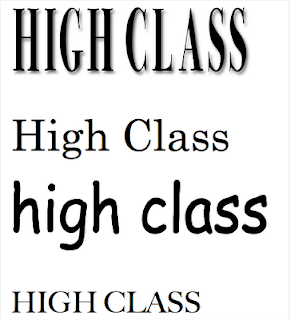
These mastheads have a range of fonts and styles. The first text is formal and sophisticated. It represents a magazine of a high standard as it stands out, is bold and looks professional. The second text is old school, which could make this appropriate as it is for a sixth form magazine. However, it is not as striking as the first text. The third font looks informal and cartoon like. If I use this it will give my magazine a cheaper look. The last font looks formal but not as modern as the first font because it looks older but still sophisticated and professional.
Monday, 23 January 2012
My Masthead Ideas
I have decided to call my magazine 'High Class'. I chose this name because the word 'High' is taken from the school's name Southend High for Girls. This means that my sixth form magazine is related to our school in particular. Also the word 'Class' could signify a classroom in the sixth form. Therefore I chose this name because it could connote a high standard.
These mastheads have a range of fonts and styles. The first text is formal and sophisticated. It represents a magazine of a high standard as it stands out, is bold and looks professional. The second text is old school, which could make this appropriate as it is for a sixth form magazine. However, it is not as striking as the first text. The third font looks informal and cartoon like. If I use this it will give my magazine a cheaper look. The last font looks formal but not as modern as the first font because it looks older but still sophisticated and professional.
These mastheads have a range of fonts and styles. The first text is formal and sophisticated. It represents a magazine of a high standard as it stands out, is bold and looks professional. The second text is old school, which could make this appropriate as it is for a sixth form magazine. However, it is not as striking as the first text. The third font looks informal and cartoon like. If I use this it will give my magazine a cheaper look. The last font looks formal but not as modern as the first font because it looks older but still sophisticated and professional.
Subscribe to:
Post Comments (Atom)

No comments:
Post a Comment